IntelGenx
A biotech company developing oral film therapeutics
across multiple therapeutic areas.
Role
UX UI
Scope
Information structure
Visual system
Tools


Turning dense biotech content into a visual story
A visualization-focused redesign of IntelGenx’s corporate website, turning text-heavy pages into a clear, scannable narrative for partners, investors, and patients.

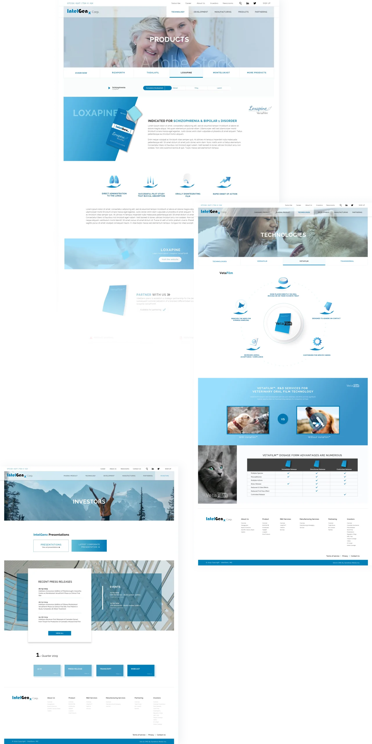
Too much dense text,
not enough guidance for users.
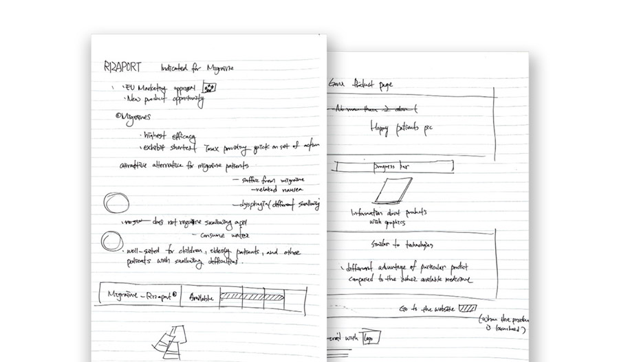
On the old site, visitors were greeted by long blocks of copy with no clear starting point, so it was hard to quickly see what was relevant to them.

Understanding the Content
I read through every page, grouped related content, and mapped
what each audience needed to understand at a glance.
Step 1
Read and map the content
Read through all pages and group the content by type.
Step 2
Find the core concepts
Identify key concepts, processes, and categories that
users need to understand.
Step 3
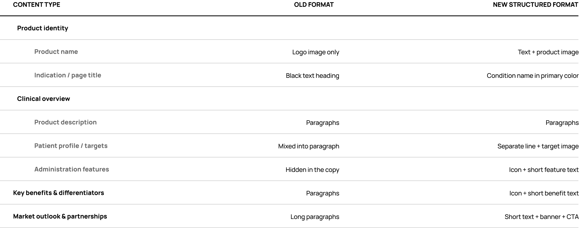
Choose the right format
Decide what must stay as precise text and what can be
turned into icons or diagrams.

Applying the System
to Key Pages
I transformed the highest-impact pages into visual narratives by reorganizing the content into scannable sections supported by icons and imagery.
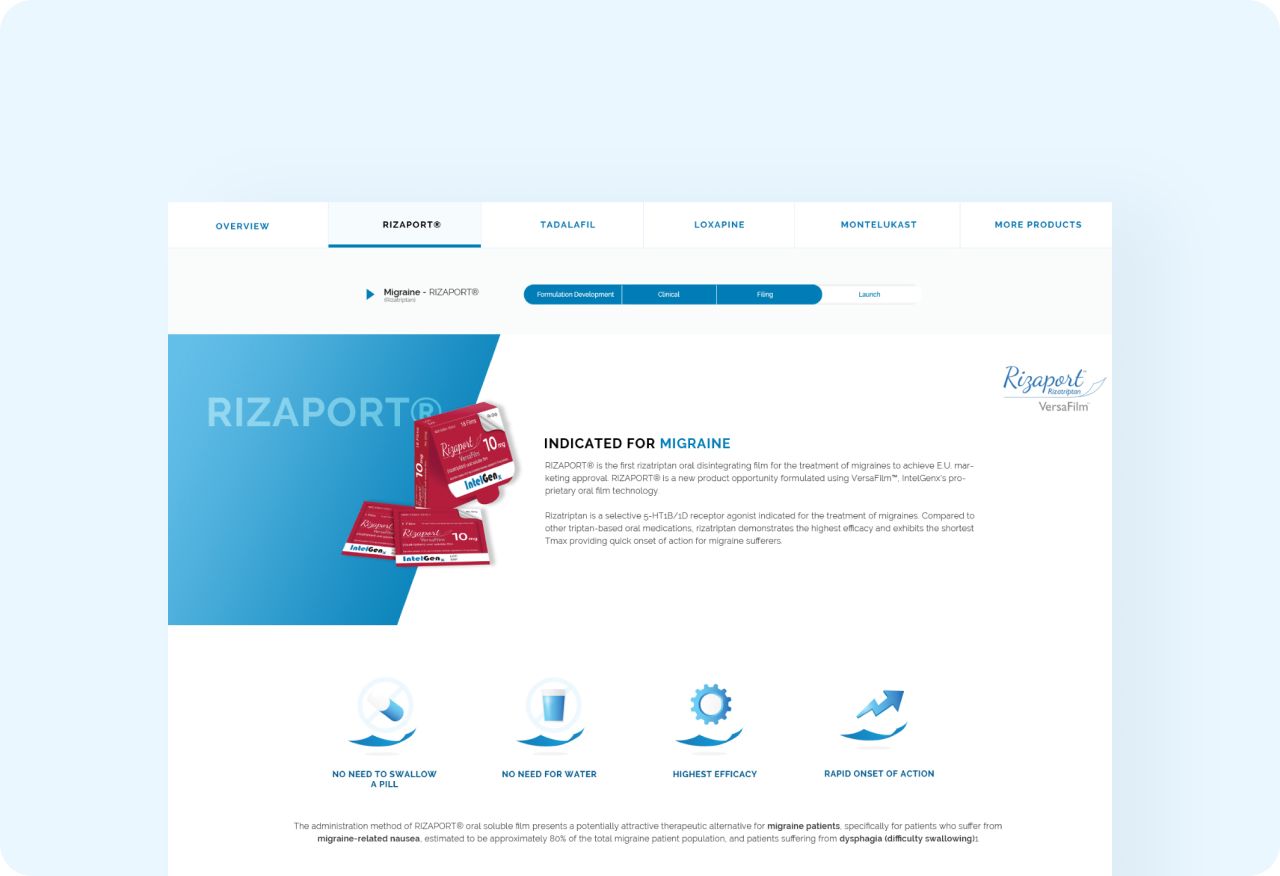
Information Architecture
Structuring the key pages
On the most important pages, I first restructured the content before thinking about visuals. I grouped related information into clear sections and defined what each section should answer for the user.
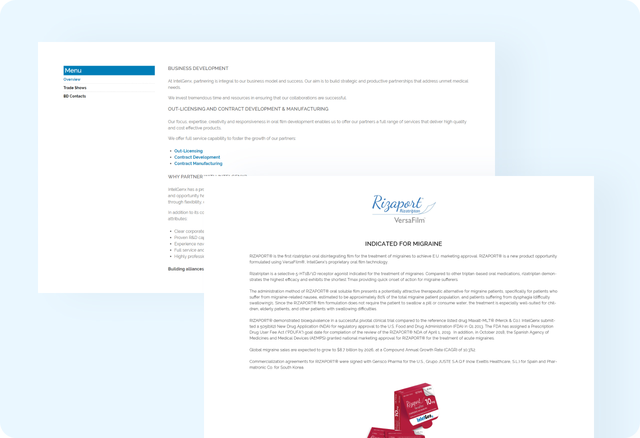
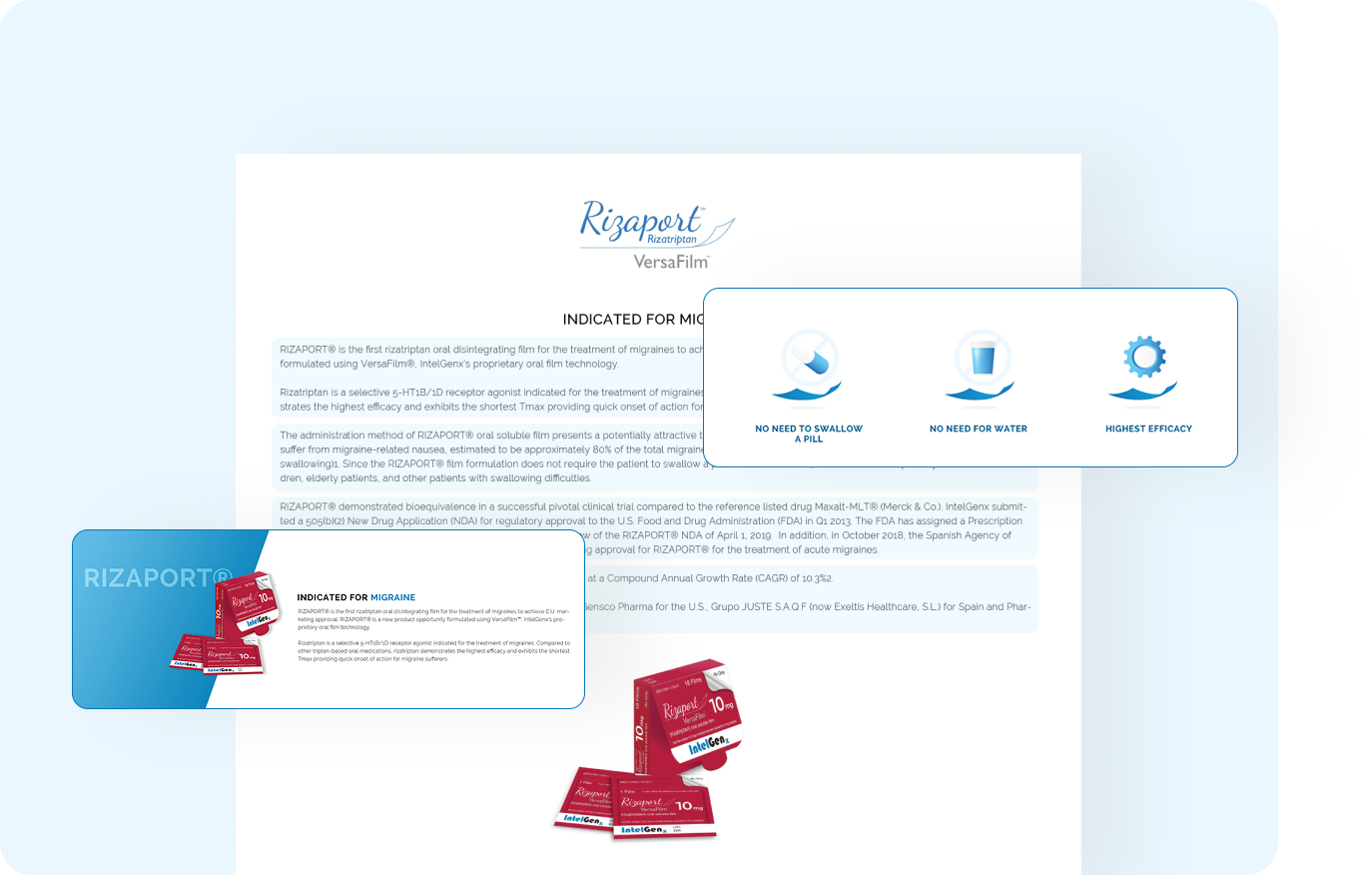
Visual Communication
Turning text into visual entry points
After restructuring the content, I used icons and diagrams as visual entry points, so users could understand the main idea before reading the details. I was careful to add visuals only where they clarified the message, not just to decorate the page.

Before & After:
What Changed on Screen
The redesign doesn’t remove information. Instead, it restructures and visualizes it so that complex content feels more approachable and less overwhelming.
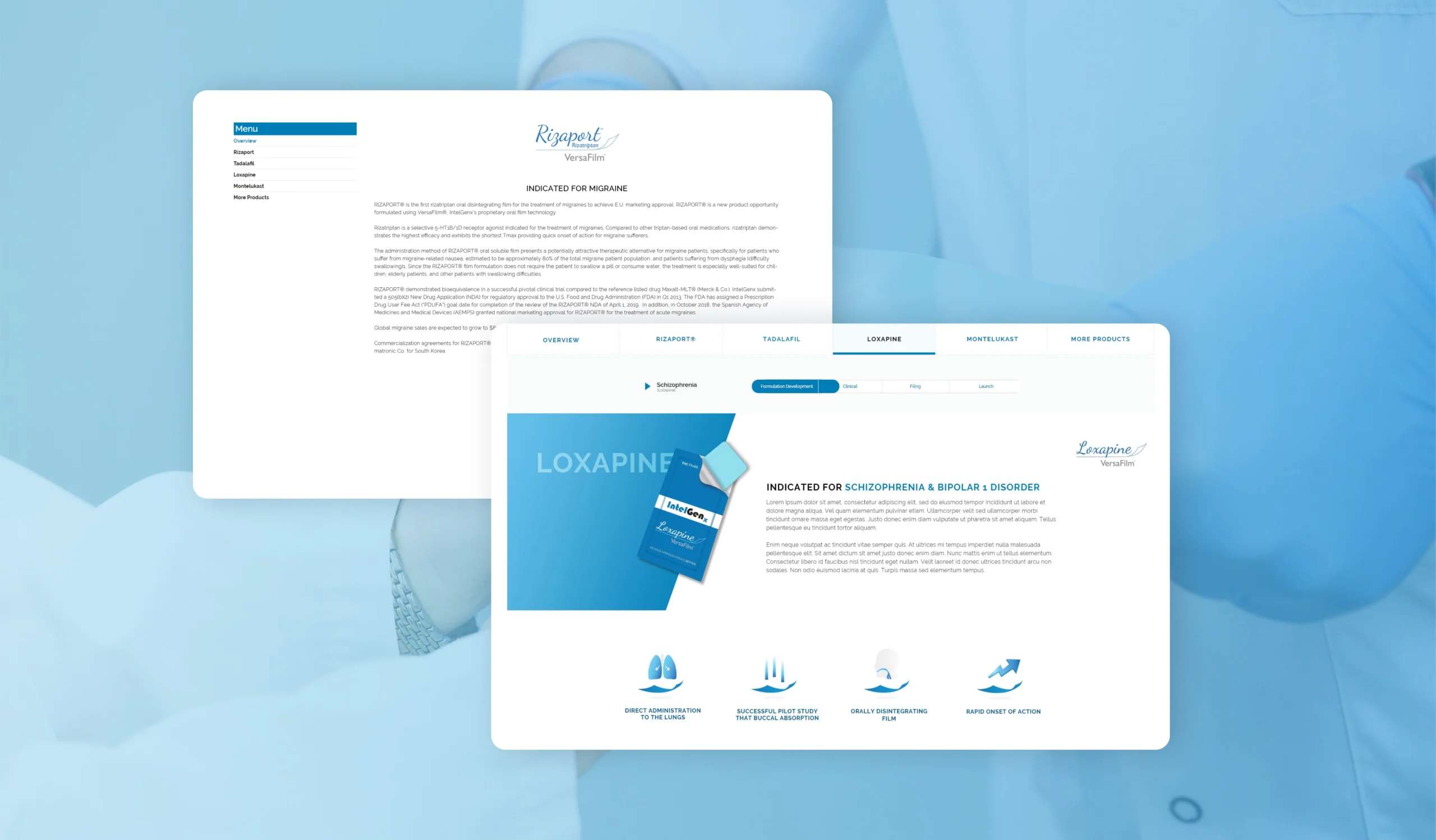
Small text, long paragraphs
Strong visual entry points
Headings, icons, and diagrams make it easy to see where to start.
Mixed details in one block
Clear sections with visual hierarchy
Split into focused sections with icons, bullets,
and images so users can quickly understand each part.
No clear starting point for the eye
Clear sense of what each page is about
Users can quickly see what each page is about within a few seconds,
instead of having to read every line.
UI Design
Turning Structure into UI