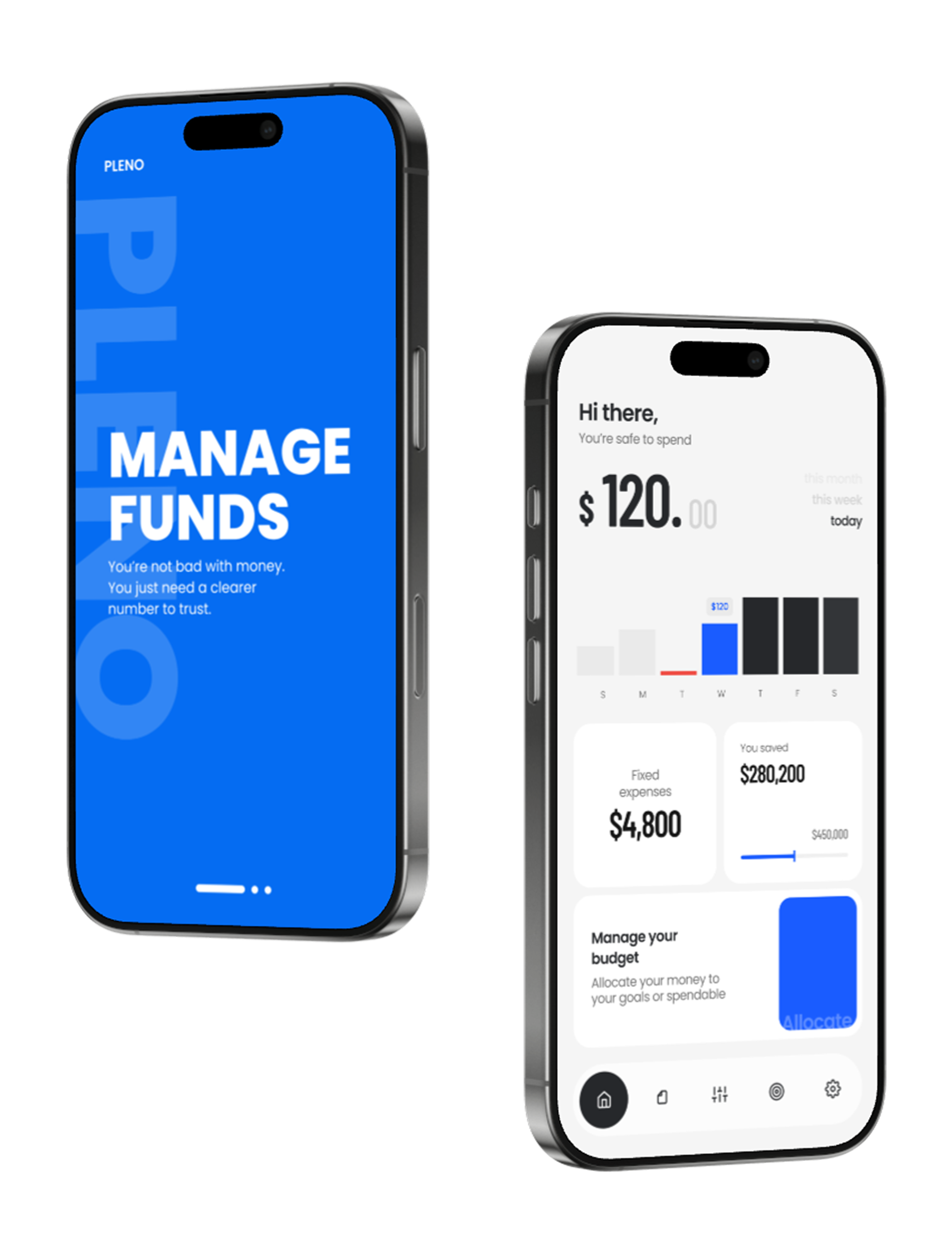
Pleno reframes “my money” into real
spendable money — grounded in behavioral psychology.
Pleno moves beyond simple tracking to behavioral correction,
helping you build better spending habits by clearly defining your true spendable income.
Type
Team-built iOS app
(development program project)
Role
UX/UI
Interaction design
Contributed to Swift implementation
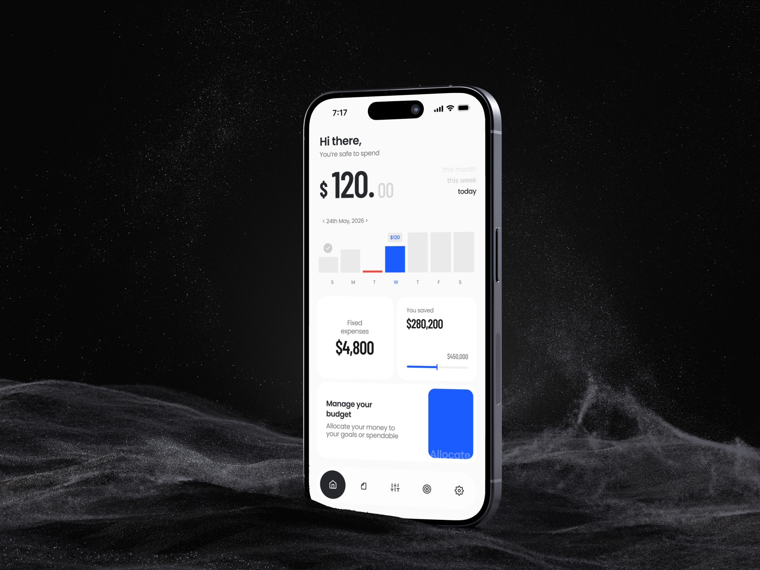
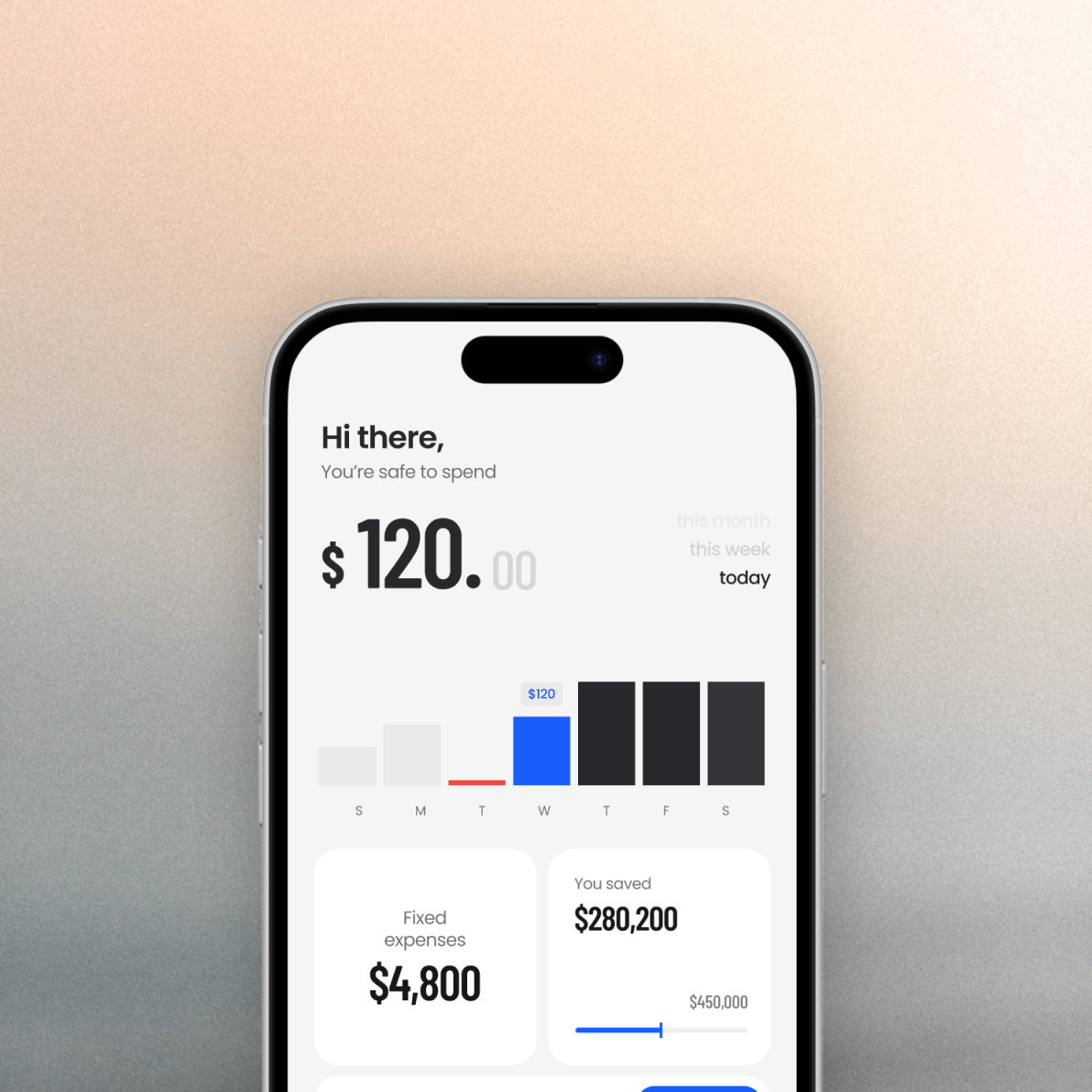
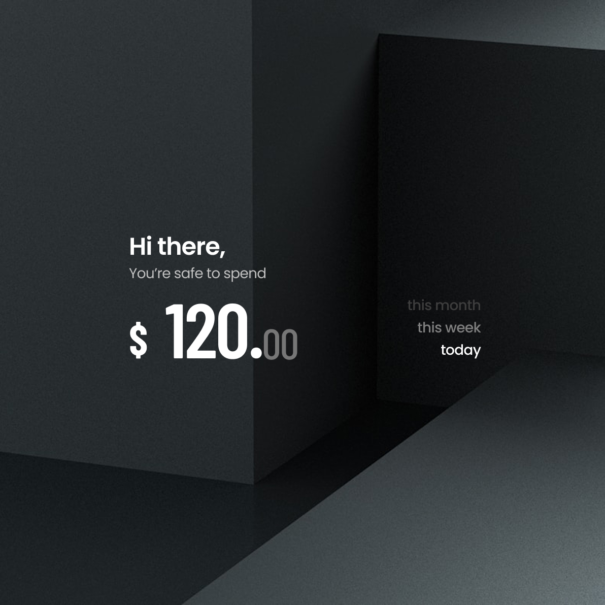
Pleno is the number designed for decisions, not tracking.
It shows how much money is actually safe to spend after fixed costs and goal allocations are accounted for.
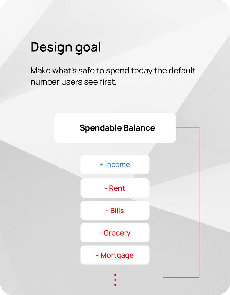
Designing
Spendable Balance
A future-aware money metric that makes
“safe to spend” visible at a glance.

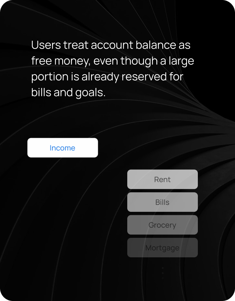
Most people don’t overspend.
They misread their money.
Account balance looks spendable,
but most of it is already committed.
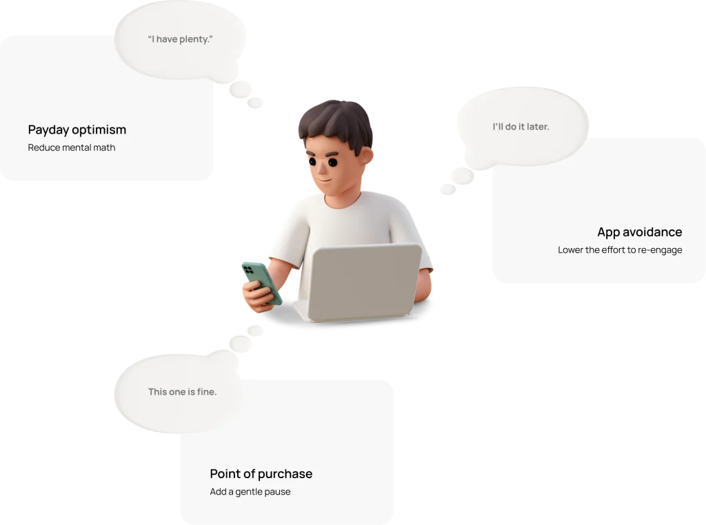
Moment Map
Where budgeting breaks
Three moments where a misleading balance
turns into overspending or avoidance.
UX strategy
Four mechanisms behind
spendable balance
Behavioral psychology turned into four UX mechanisms — built for the moments where budgeting breaks.
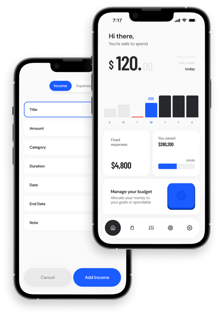
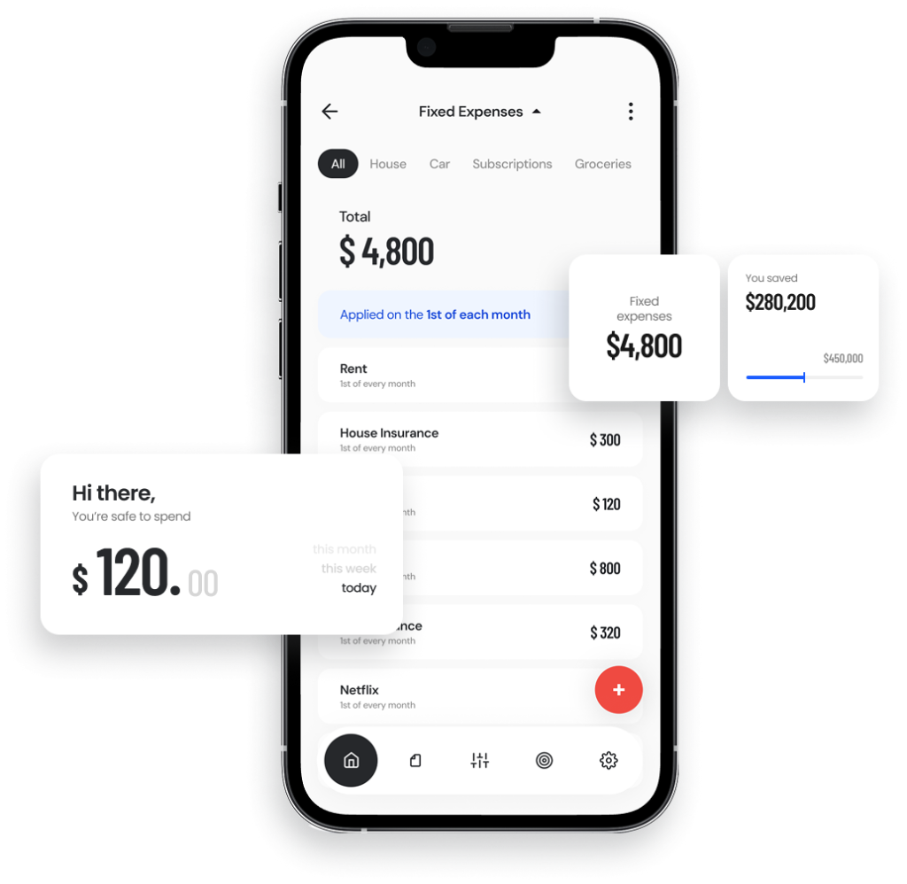
Default Metric Reframe
Give Your Brain a Break—Let Me Handle It
Uncertainty creates mental load. By showing Spendable Balance after fixed costs and goals, the app removes mental math and makes spending decisions clearer.
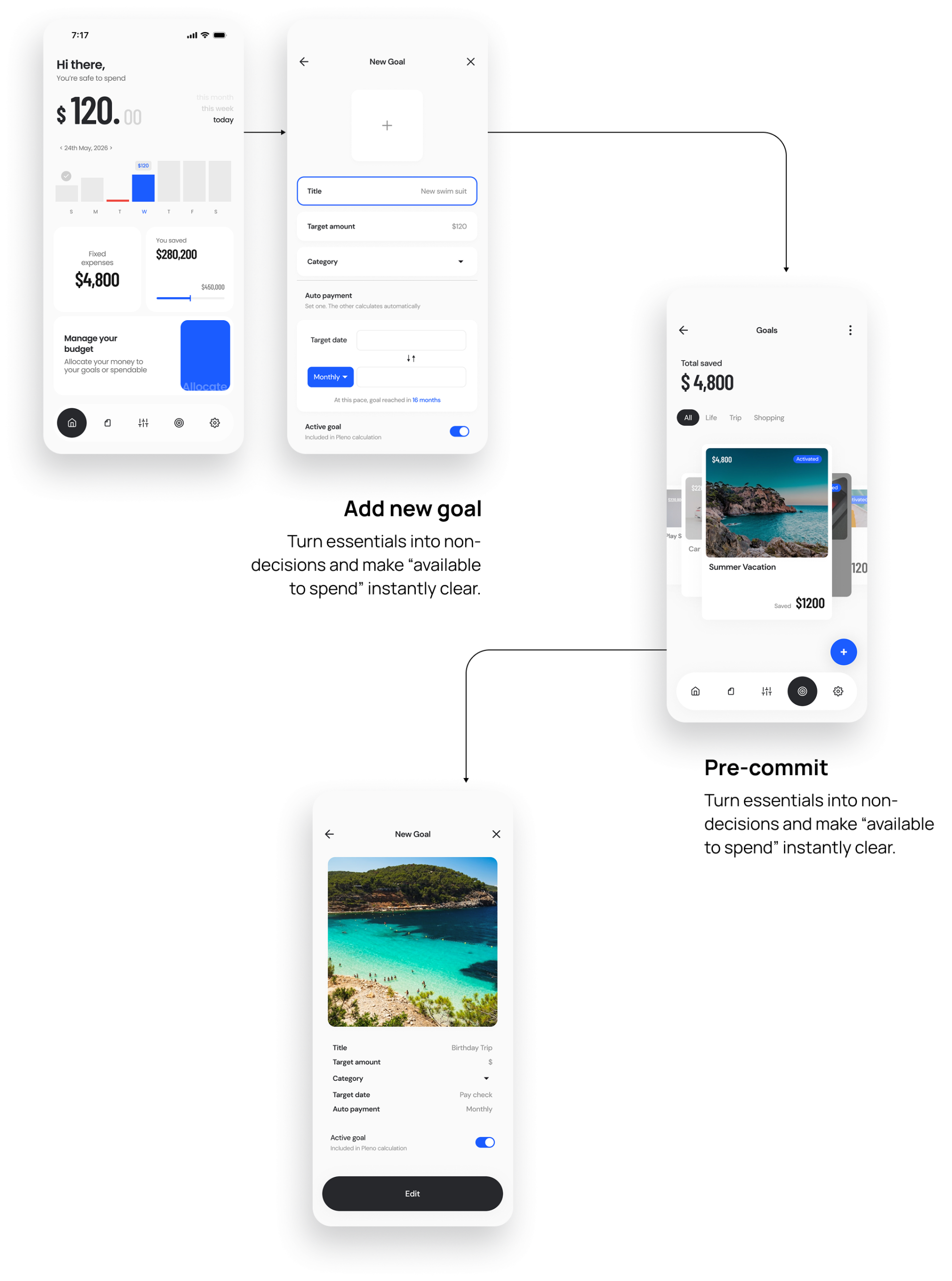
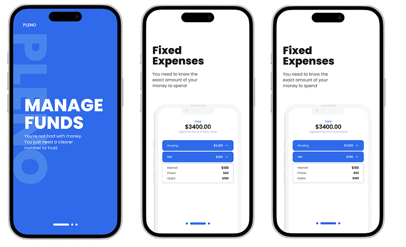
Pre-Commitment via Fixed Expenses
Your Brain Makes Thousands of Decisions a Day—Let’s Cut That Down.
Fewer small money decisions means fewer chances for impulse spending. By locking fixed expenses upfront, the app turns essentials into non-negotiables—reducing decision load by design.
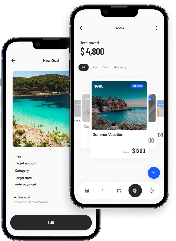
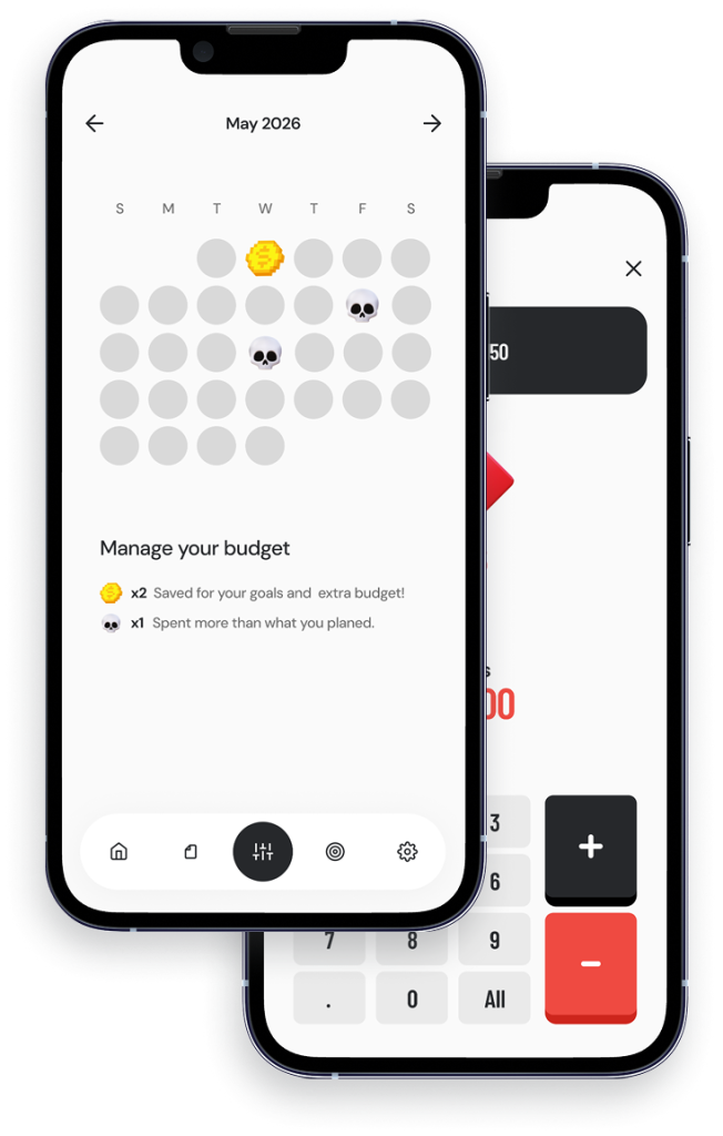
Saving as a Reward Loop (No guilt)
What If Hitting Your Savings Goal Felt Like a Shopping Spree
Expense logging is reactive and often feels like punishment. Goals create anticipation and visible progress, making saving feel like a rewarding loop instead of deprivation.
Auto-allocation + Loss-aware Feedback
Spending Feels Different When You See It as Losing
When money is allocated to goals first, spending is no longer “using leftover money.” It becomes “taking away progress,” which people feel more strongly and naturally try to avoid. This makes trade-offs clearer and supports better self-control without guilt.
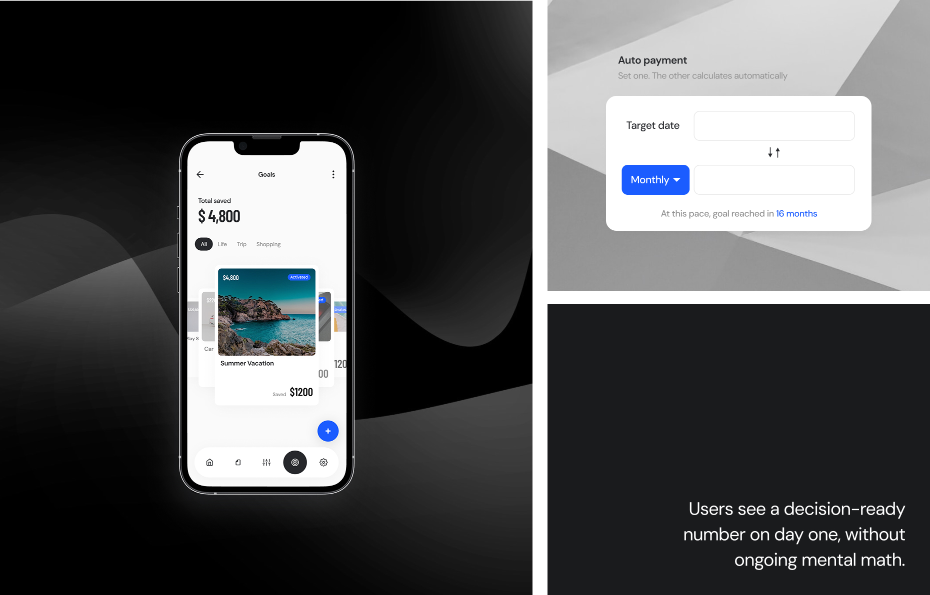
Users see a decision-ready
number on day one,
without ongoing mental math.
Proof of UX
How It Works in
Real Life