Spendable reframes “my money” into real
spendable money — grounded in behavioral psychology.
I redesigned the default money metric so users instantly see
what they can actually spend after fixed costs and goals.
Type
Team-built iOS app
(development program project)
Role
UX/UI
Interaction design
Contributed to Swift implementation
Tools


Concept
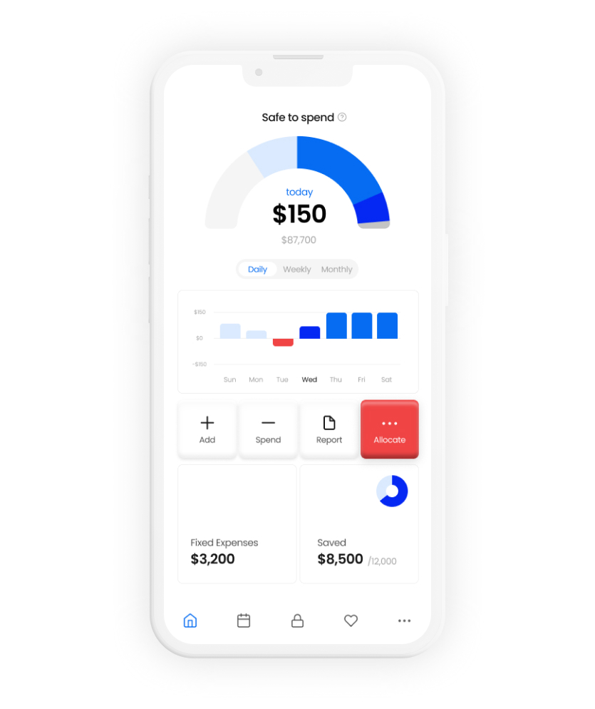
Designing Spendable Balance
A future-aware money metric that makes
“safe to spend” visible at a glance.
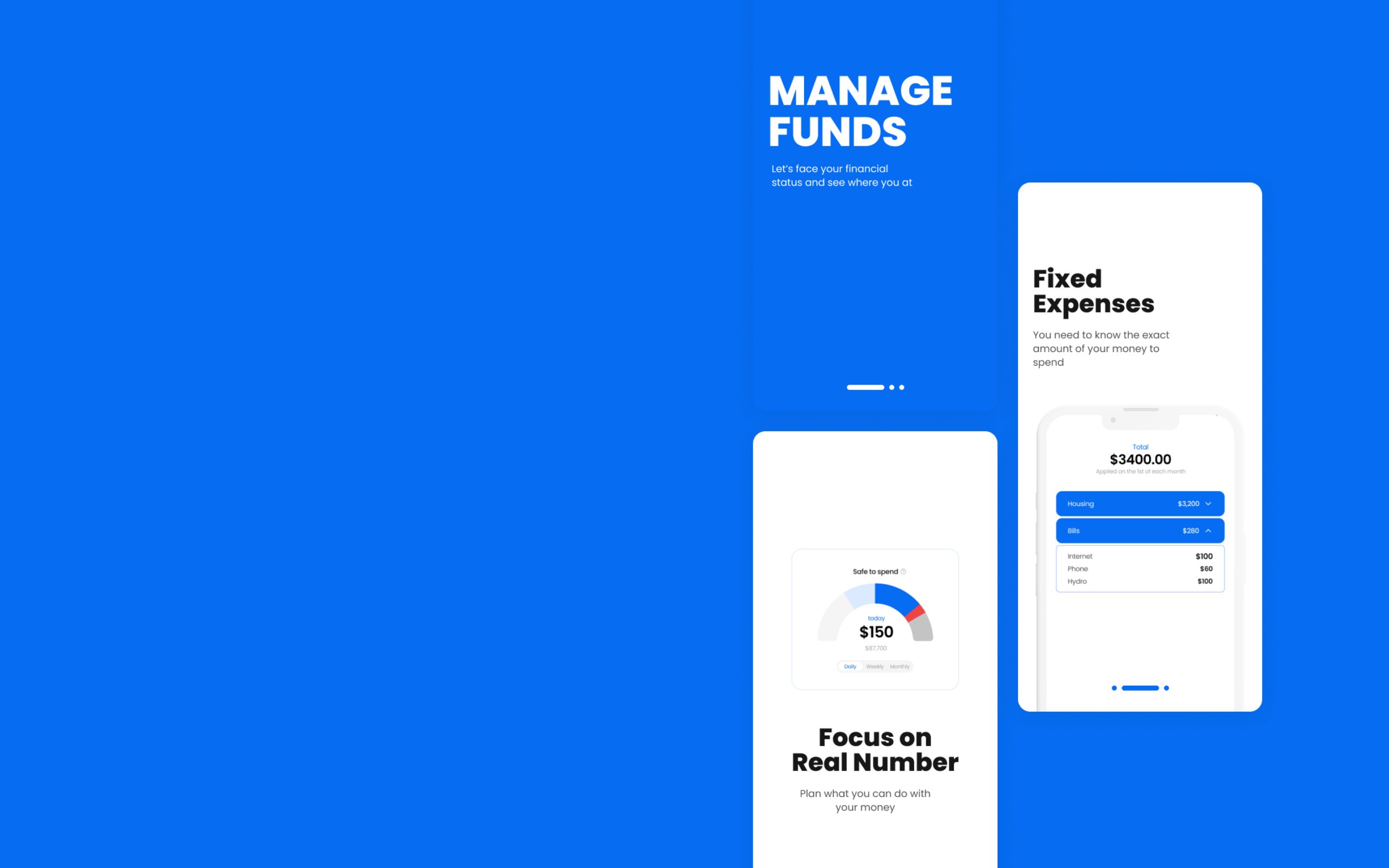
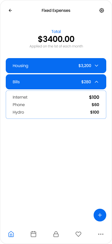
Spendable Balance is the number designed for decisions, not tracking.

It shows how much money is actually safe to spend after fixed costs and goal allocations are accounted for.

Problem
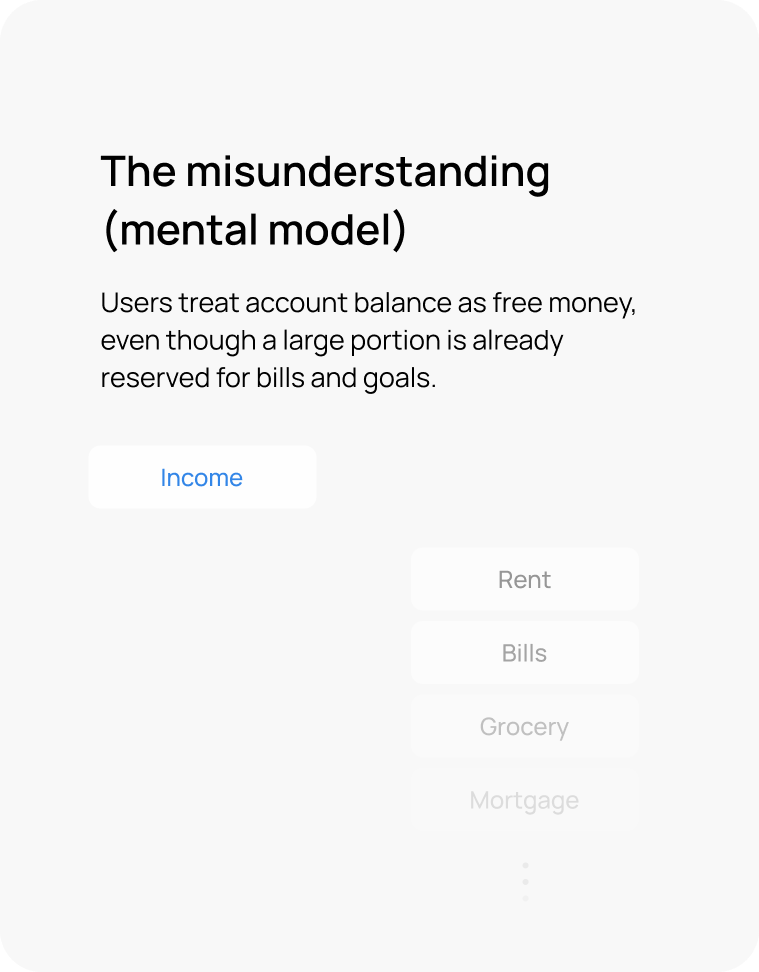
Most people don’t overspend.
They misread their money.
Account balance looks spendable,
but most of it is already committed.
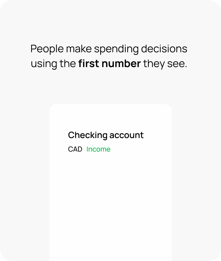
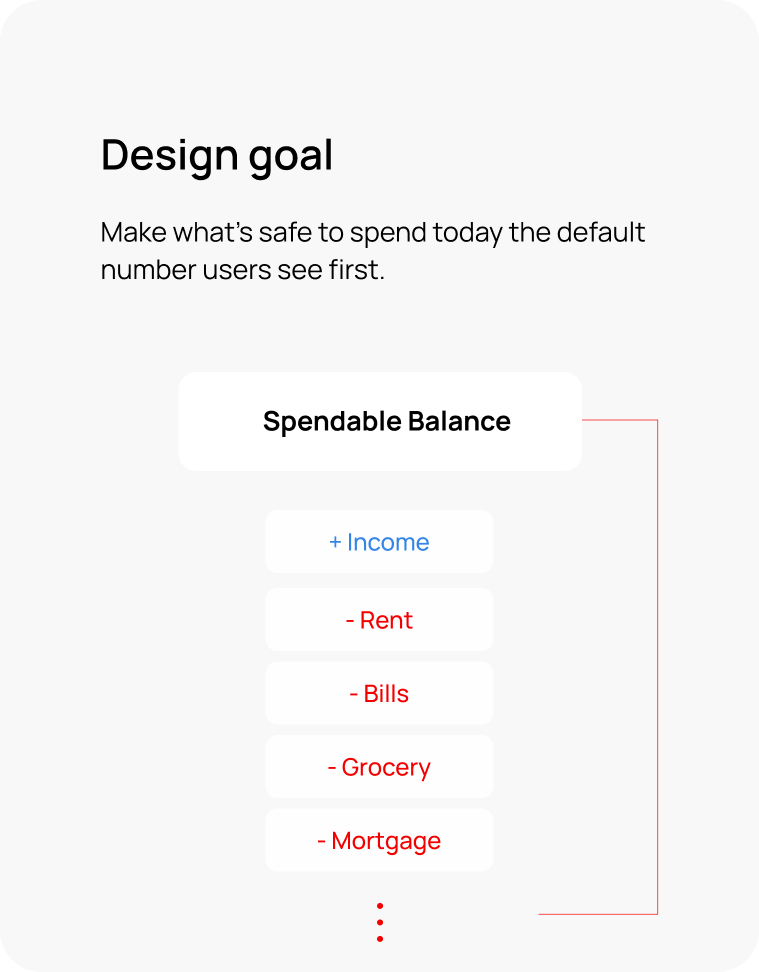
So I changed the default number.
By making Spendable Balance the primary metric, budgeting shifts from reactive logging to proactive control.
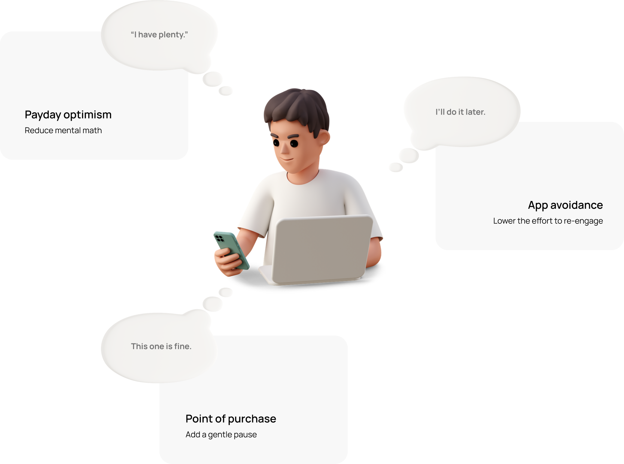
Moment Map
Where budgeting breaks
Three moments where a misleading balance
turns into overspending or avoidance.
UX strategy
4 mechanisms behind
Spendable Balance
Behavioral psychology turned into four UX mechanisms
— built for the moments where budgeting breaks.
Default Metric Reframe
Give Your Brain a Break
—Let Me Handle It
Prospective Processing & Reducing Cognitive Load
Uncertainty creates mental load. By showing Spendable Balance after fixed costs and goals, the app removes mental math and makes spending decisions clearer.
Your Brain Makes Thousands of Decisions a Day—Let’s Cut That Down.
Preventing Decision Fatigue
Fewer small money decisions means fewer chances for impulse spending. By locking fixed expenses upfront, the app turns essentials into non-negotiables—reducing decision load by design.
What If Hitting Your Savings Goal Felt Like a Shopping Spree
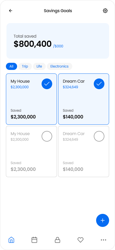
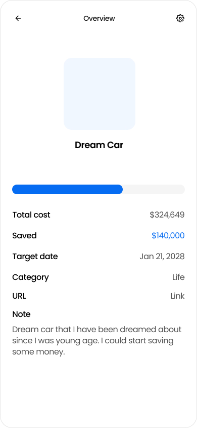
Reward System & Dopamine Regulation
Expense logging is reactive and often feels like punishment. Goals create anticipation and visible progress, making saving feel like a rewarding loop instead of deprivation.
Spending Feels Different When You See It as Losing
Loss Aversion & Psychological Sense of Control
When money is allocated to goals first, spending is no longer “using leftover money.” It becomes “taking away progress,” which people feel more strongly and naturally try to avoid. This makes trade-offs clearer and supports better self-control without guilt.
Proof of UX
How It Works in Real Life
Three real-life flows that demonstrate
the mechanisms in action.
Flow 1 — Setup (2 minutes)
Goal: Turn essentials into non-decisions and
make “available to spend” instantly clear.
Mechanisms: Reframe · Pre-commit · Reward
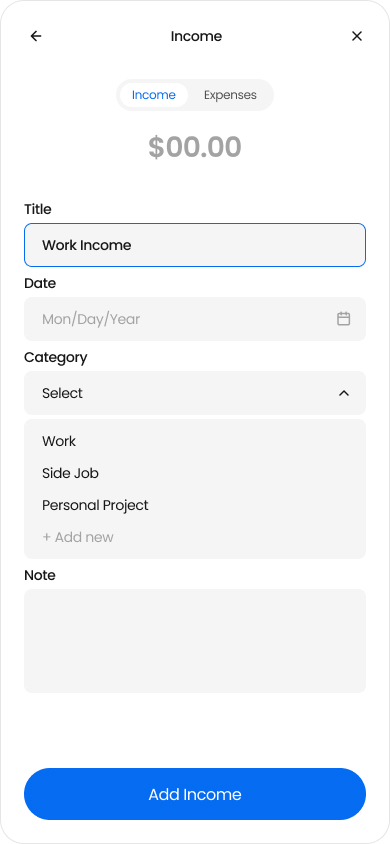
Add income
(starting point)
Set fixed expenses (weekly/monthly/date) → locked
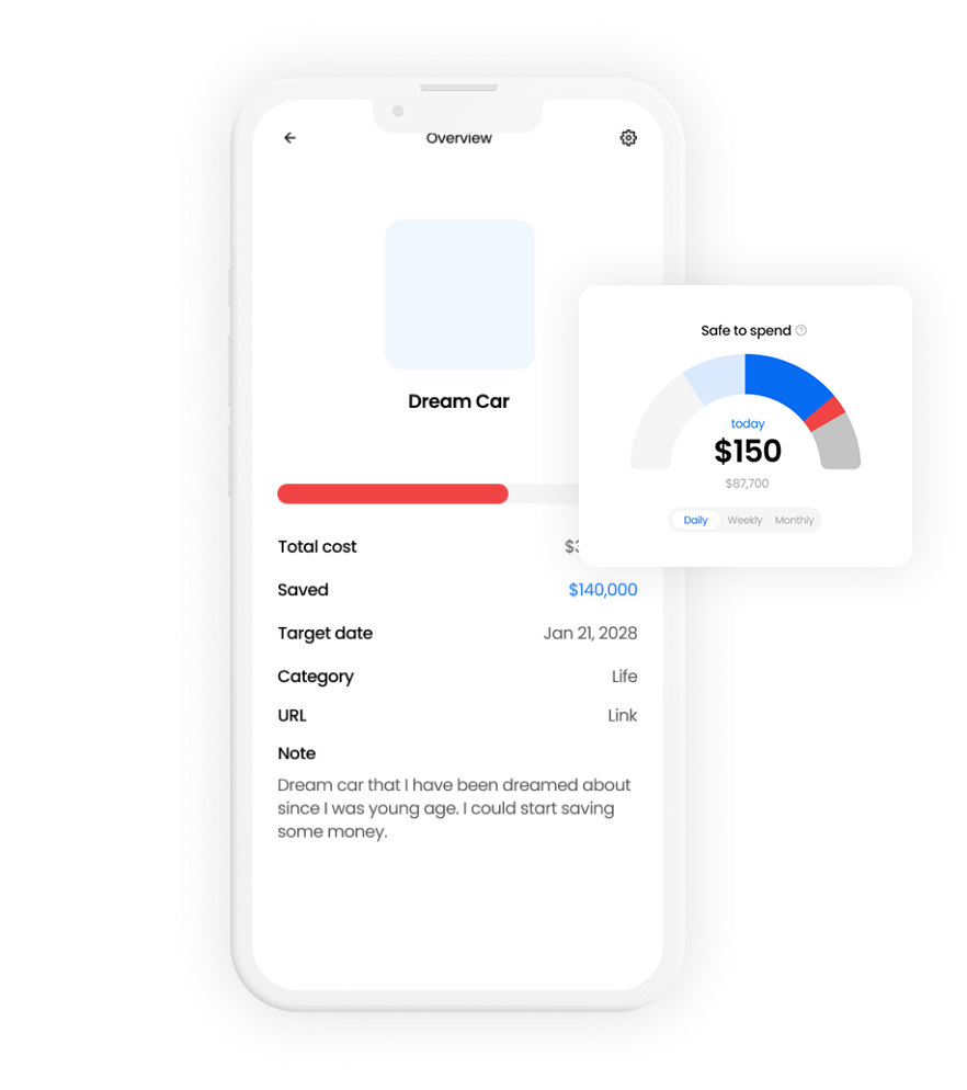
Create goals + allocate amounts

Land on Home → Spendable Balance + combined goal progress
Flow 1 — Purchase moment (10 seconds)
Goal: Add a gentle pause before spending by
making trade-offs visible.
Mechanisms: Reframe · Loss-aware feedback · Reward
From Home, tap to add an expense
Enter amount/category (quick entry)
Preview impact (Spendable decreases / goal progress drops)
Confirm → updated balance + progress
Learnings + Next bets
What I learned
and what I’d build next
Key takeaways from designing Spendable Balance,
plus the next experiments to reduce friction and strengthen the habit loop.
The default number shapes behavior.
Changing the primary metric changed how users interpreted “my money” in daily decisions.
Friction is the real enemy of budgeting.
Habit breaks don’t come from lack of intent, but from effort at the wrong moment.
The default number shapes behavior.
Visible goal progress can motivate better than reactive logging, as long as feedback stays neutral.