Redesigning Biotech: Managing Constraints, Delivering Solutions
A UX case study on revamping PDS Biotech’s
website and interactive map.
Project Overview
Revamping PDS Biotech’s Website & Interactive Map
PDS Biotech needed a website redesign to better communicate with key audiences such as investors, researchers, and patients. The previous site felt outdated and text-heavy, making it difficult for users to quickly find important information. The project required completing the website redesign, interactive map, graphic design, and presentation design — all within a tight deadline, with myself as the sole designer.
To manage this effectively, I prioritized the core website structure and usability improvements first, ensuring a smooth launch before fully developing the interactive map. I also established clear timelines and milestones for each phase, allowing steady progress on both the website and interactive feature without compromising quality.


The Challenge
Users Struggled to Find
and Understand Key Information
The original PDS Biotechnology website overwhelmed users—investors, researchers, and patients struggled to find relevant information due to dense content, poor structure, and outdated design. It failed to clearly communicate the company’s mission, clinical trial progress, or value proposition.
Solution
Redesigning for Clarity, Credibility, and
User-Centered Access
Redesign the website with user-focused architecture, clear content hierarchy, and modern visuals—delivering a clean, credible, and accessible experience tailored to each audience. Prioritized usability improvements and integrated an interactive map, all under tight constraints.

Gather feedback and refine it over multiple iterations while the core website is being developed

Color
To maintain brand recognition, I retained the company’s signature green but used a darker value to convey greater weight and credibility—appropriate for an information-focused corporate website.

Font

Title
Roboto
Bold Regular

Paragraph
Raleway
Semi Bold Regular Light
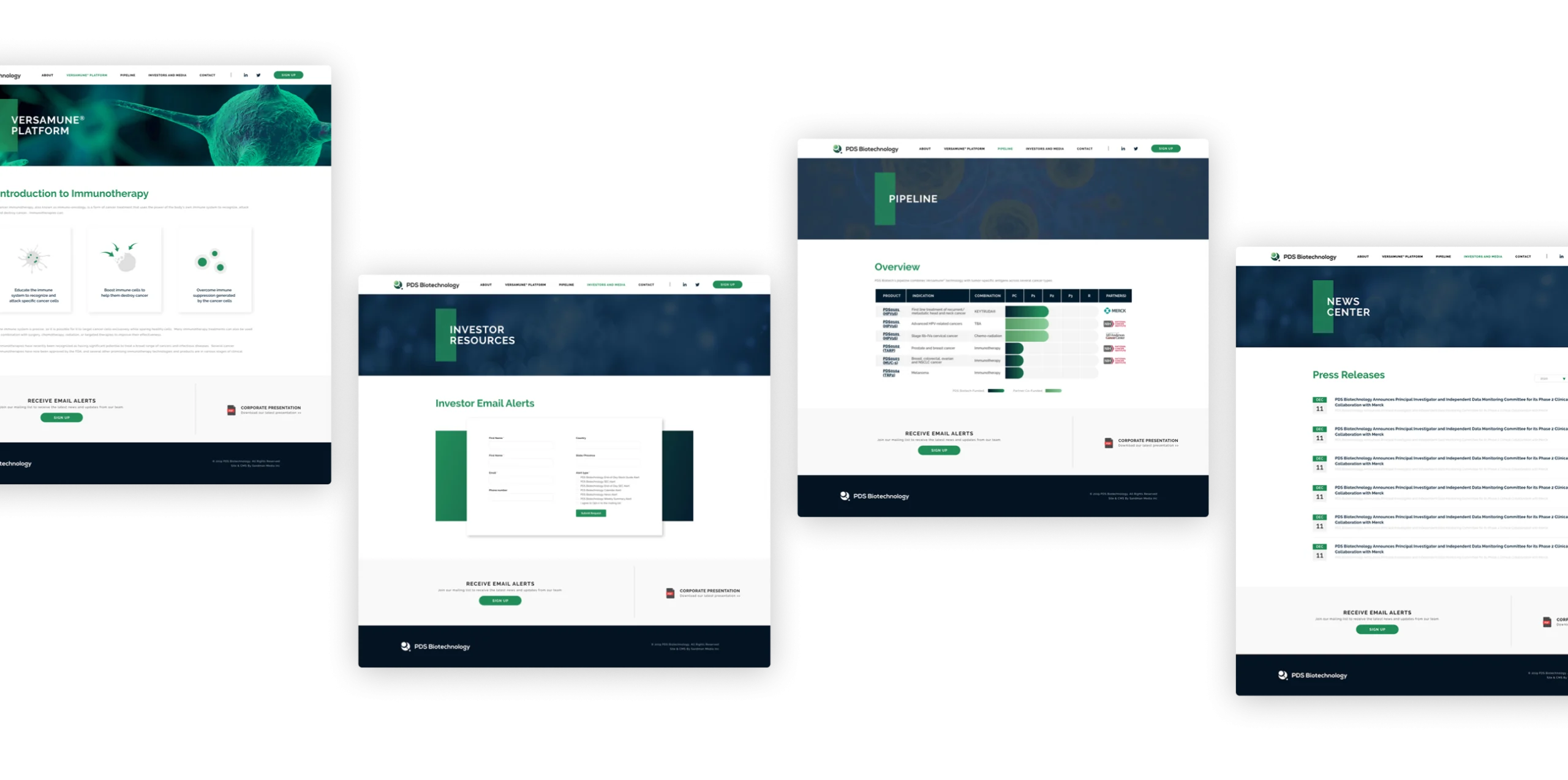
Page Architecture & UI
Enhancing layout, hierarchy, and visuals to create a seamless user experience through strategic wireframing, iterative page improvements, and refined details.
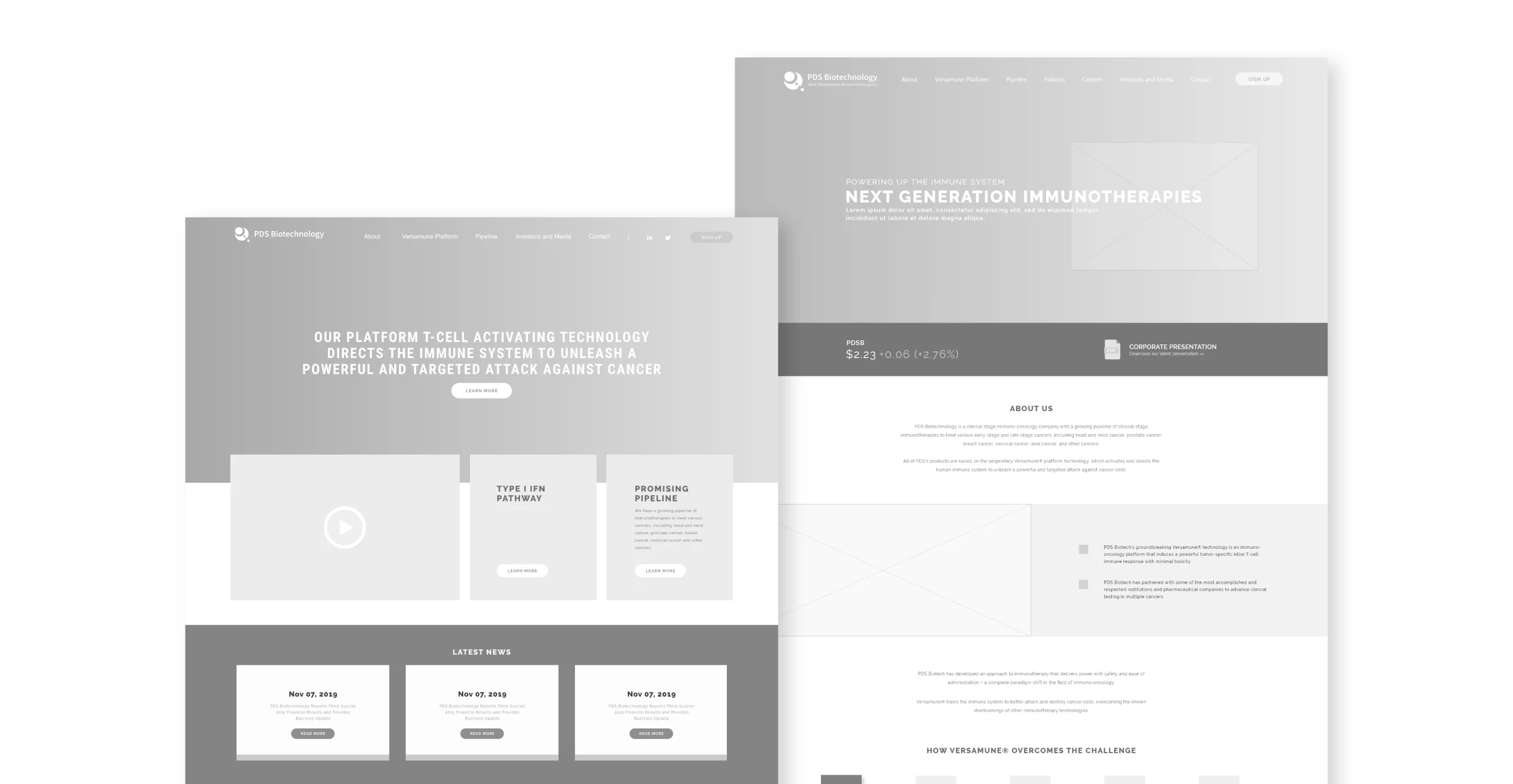
Landing Page Evolution
Iterating on layout, messaging, and visuals
for better performance.
I used PDS’s signature green and a clean, trustworthy design to reflect their biotech identity. To help users easily follow the content flow, I iterated on the layout and messaging for better clarity and navigation. Scientific visuals combined with modern UI elements highlight the brand’s innovation and credibility.

Enhancing Readability with Layout and Graphics
The original pages were heavy with text and lacked visual hierarchy. I restructured the layout and added custom visuals to guide users intuitively through complex information, improving both comprehension and user flow.


Strengthening Brand Identity Through Visual Consistency
To unify the experience, I created on-brand graphics that align with PDS’s tone and color system. This ensured a cohesive visual identity across pages and reinforced trust through consistent design language.
Interactive Map Solution
Built a functional map using CMS extensions to overcome dev limitations
The development team faced limitations due to the complexity of the interactive map, which risked delaying the overall website launch. With tight deadlines, we prioritized the core website and planned the map feature in phases to ensure timely delivery.

How We Solved It
Although we had to adjust the design layout, we avoided building a completely new map from scratch by utilizing search presets and CMS extensions. This allowed us to create a solution that closely aligned with our original plan, successfully meeting both functional and visual requirements within the given constraints.
Option 01

The design closely resembles the original concept from the development phase.
❌
It does not support updating multiple locations simultaneously, which limits its functionality.
Option 02

It effectively presents multiple pieces of information at once, making it easier to view different data points.
❌
The layout does not align with the original intent of creating an interactive experience for users.
Option 03

The screen is divided into a map and a text section, creating a clean and organized layout.
✅
While it requires some modifications to the original design, these changes are minimal and allow for the intended functionality to be implemented effectively.
Takeaways
Adapt, Solve, Deliver
This project reinforced that constraints can drive creative solutions. Instead of seeing limitations as roadblocks, they became opportunities to rethink our approach. By prioritizing effectively, managing time wisely, and staying adaptable under pressure, I successfully delivered a high-quality redesign while integrating new interactive elements. Problem-solving isn’t just about fixing issues—it’s about turning challenges into better outcomes.